Printing
How to prepare files for large-format printing
What a file needs to print well in large format
To print in large format without surprises, the file should arrive as a PDF, at final size or at a stated scale, in CMYK colour mode, with logos and text as vectors, fonts outlined or embedded, images with enough resolution for the distance they will be viewed from, and the bleed the print shop asks for.
Get those right and you avoid most of the back and forth. We go through them one by one, along with the mistakes we see most often in files for banners, vinyl, murals and POS displays.
Format: PDF and vectors wherever possible
The safest format is a high-quality print PDF (many programs offer it as PDF/X). It brings vectors, images and fonts together in a single file and travels best between the design studio and the print shop.
Within that PDF, make sure that:
- Logos, text and flat shapes are vectors. A vector can be enlarged to any size without losing sharpness, and in large format that is exactly what happens.
- Photos are at the best quality available, without heavy compression. A highly compressed JPG that looks fine on screen can show blocks and halos when it is blown up to several metres.
- Nothing is missing: no linked images left behind and no effects that only exist in the original software.
If you work in Illustrator, InDesign or similar, we can also take the open file with its links. What does not work well are formats designed for screens or office use, such as a PowerPoint or an image downloaded from a website: they usually have low resolution and RGB colours.
Resolution: it depends on the viewing distance
The most common question is ‘what dpi should I use?’. The honest answer is that it depends on how far away people will be when they look at the piece.
The eye does not pick up the same detail at half a metre as at twenty. A counter display or a vinyl on a reception desk is seen up close and needs more resolution. A building banner read from across the street needs far less, because nobody walks up to count pixels.
As a common rule of thumb in the trade, always measured at final size:
- Pieces seen up close (POS, roll-ups, indoor signage): around 150 dpi usually gives a sharp result.
- Mid-distance pieces (murals, hoardings, shop windows): you can go somewhat lower without it showing.
- Pieces seen from afar (building banners, billboards, scaffolding wraps): much less is enough, because the distance makes up for it.
Upscaling a small image does not help: the software invents pixels and the photo still looks soft. If you are not sure an image will hold up at size, send it to us before you sign off the design and we will tell you.
Scale: how to work on pieces several metres long
A file for a ten-metre banner at full size can be huge and awkward to handle. That is why it is normal to design to scale, for example at 1:10, as long as it is done properly:
- State the scale in the file name or in a note, for example ‘building-banner-scale1-10.pdf’.
- Keep the exact proportions of the substrate. A few millimetres out on the draft becomes centimetres once printed.
- Adjust the resolution to the scale. At 1:10, images need ten times the resolution they would need at final size, because they will be enlarged ten times.
- Start from real measurements, not approximate drawings. On façades, hoardings or existing fixtures, ideally measure on site.
That is how we handle irregular surfaces. In a service-station shop for Leroy, every front and every shelving unit was measured on site, and the graphics were laid out bay by bay, following the breaks in the furniture.
Bleed, safe area and finishing
Bleed is the part of the design that extends beyond the final size and is lost when the piece is trimmed or fitted. It stops white edges appearing if the cut or the installation is slightly off.
In large format the bleed depends on the finish, so always ask the print shop how much they need. A vinyl trimmed flush is not the same as a banner with hems and eyelets, or a fabric tensioned on a frame that wraps round the back: those need considerably more margin than a leaflet.
As well as bleed, leave a safe area inside the edge. Logos, text and phone numbers should not sit right against the border. On a banner, that strip is where the eyelets or tensioning system go. On a display, it is where the material folds or slots together. If important text falls there, it gets covered or distorted.
Colour: CMYK, brand colours and why your screen lies
Screens work in RGB (light) and printers in CMYK (ink). Some very bright RGB colours, especially greens, oranges and electric blues, cannot be reproduced the same way with ink. If the file arrives in RGB it will still be converted, but the result may look duller than you expected.
So:
- Set the file up in CMYK from the start, or at least check how it looks once converted.
- If your brand has defined corporate colours (Pantone or specific CMYK values), tell us so they can be matched to the material.
- Bear in mind that the substrate changes the colour: the same file does not look the same on banner, vinyl, fabric or rigid board, nor in daylight versus backlit.
- Do not trust your monitor. Every screen shows colour differently. If colour is critical, ask for a proof.
Outlined fonts and other details that cause problems
If a file uses a font that is not installed on the computer opening it, the software swaps it for another and the text changes. To avoid this, outline the fonts (convert them to curves) or make sure the PDF has them embedded. Always keep an un-outlined copy in case something needs correcting.
Other things worth checking before you send:
- Large black areas: ask the print shop for their recommended build. A black made with black ink alone can look greyish over large surfaces.
- Very thin lines: what looks like a line on screen can disappear on some materials or break up in cut vinyl.
- Transparencies and shadows: check the exported PDF for boxes or tone shifts where there should not be any.
- Typos: a mistake on a banner several metres wide can be read from the street. Check phone numbers, websites and addresses carefully.
Printing in panels: where the joins fall
Many large-format pieces cannot be printed in one go. A mural, a hoarding or a very wide banner is printed in panels that are joined on installation. The print shop works out the split, but the design can make that easy or hard.
Ideally, faces, logos and small text should not land on a join. If you know where the cuts will go, put background or less critical imagery there.
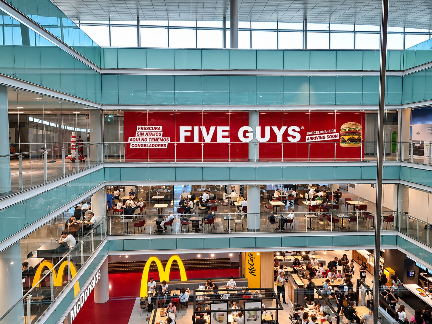
On the construction hoarding we printed and installed for Five Guys in Barcelona, the graphics were printed in panels sized to each section, keeping the corporate red continuous from one end to the other. On the touring display unit for Oakley, the graphics were split panel by panel from the real measurements of the container, with the cuts placed on the structure's joints so no image was broken over a rib.
Checks and proofs before printing: a quick list
Before production we check every file and let you know if we spot anything that could cause trouble. Even so, this run-through will save you time:
- Print-quality PDF, at final size or with the scale stated.
- Measurements checked against the real surface.
- CMYK colour mode and brand colours specified.
- Logos and text as vectors; fonts outlined or embedded.
- Image resolution suited to the viewing distance.
- Bleed and safe area to suit the finish.
- Key text kept clear of edges, eyelets, folds and joins.
- Text, phone numbers and websites proofread.
If colour or the final result is critical, ask for a colour proof or a full-size printed section on the final material. It is the most reliable way to see how it will look before the whole piece goes into production.
Our large-format printing page shows the substrates we work with. If you have not chosen a material yet, have a look at the types of advertising banners or our banner weight guide. And once your files are ready, ask for a quote or call us on +34 937 50 23 04: we manufacture in Barcelona and install throughout Spain.
Frequently asked questions
What is the best file format for large-format printing?
What resolution does a banner need?
Can I send the file in RGB?
How much bleed should I leave?
Can I design to scale?
Will you tell me if there is a problem with my file?
Related articles
Guide to canvas weights: what they mean and how to choose
Everything about canvas weights to make technical and profitable decisions.Read article
Types of advertising banners and their applications
Practical guide to choosing advertising canvas according to location, duration and visual objective.Read article
Trends in large format printing
The trends that are transforming large format digital printing: sustainability, technology and new materials.Read article


Need this service?
Request a no-obligation quote.