
Restaurant
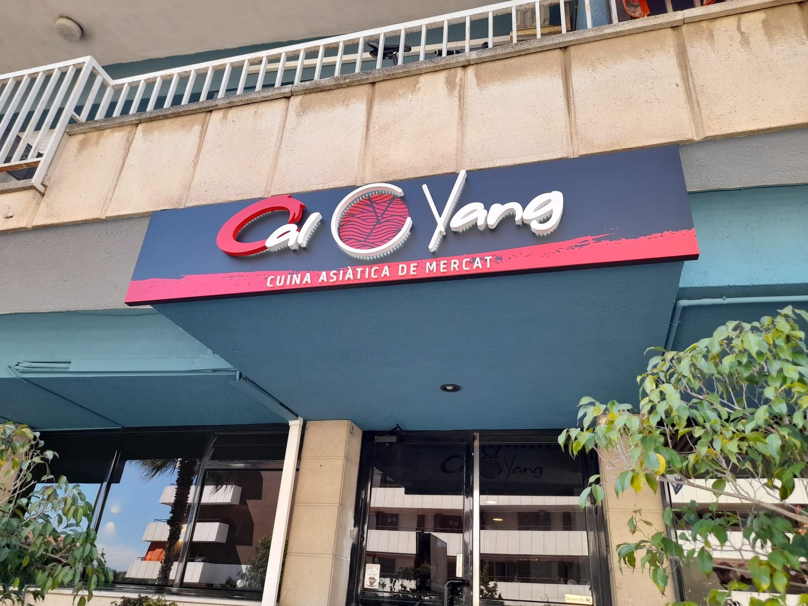
Cal Yang Facade sign and interior logo for a restaurant
What we did
- Client
- Cal Yang
- Sector
- Restaurant
- Area
- Signage
- Type of work
- Shop signage · 3D letters
- Location
- Spain
Exterior and interior identity for Cal Yang, a market-style Asian restaurant. On the facade, a dark panel sign carries the name in raised letters, the circular symbol in red and a lower band with the strapline; inside, the logo is repeated at the entrance to carry the brand through.
The challenge
The sign sits on a corner canopy and has to read both head-on and from the side pavement. The logo combines a handwritten typeface with a circular symbol, which called for precise cutting.
Our solution
A rigid panel in a dark tone was made as the sign background, with the red lower band and strapline printed. The built-up letters and symbol were fixed onto it, cut from the logo's vector file to keep the handwritten stroke. The assembly was anchored onto the canopy with on-site setting-out, keeping it parallel to the facade line. Inside, the logo was applied to the light wall at the entrance.
Materials used
- Rigid background panel in a dark finish
- Built-up letters and symbol cut to size
- Lower band with printed strapline
- Fixings onto the canopy
- Interior logo on the wall
Results
- Restaurant name and symbol legible from the street
- The sign uses the canopy as its support with no extra building work
- Brand continuity between facade and interior
- Clear contrast between light letters, red and dark background
The work up close
Similar projects


Want a similar project?
Tell us your idea and we'll help make it a reality.